CSS Interview Questions
1. What is CSS?
CSS stands for Cascading Style Sheets. It is used to style web pages. We can style html elements with CSS properties.
CSS files are stored with .css extension.
2. How many types of styling are there?
There are 3 ways to style any web page or web element -
- Inline CSS - Styling is done at the element level using an attribute called
style - Internal CSS - Styling is done for specific web page inside
<style>tags - External CSS - Styling is done via external CSS file
Inline CSS
<body style="background-color: #efefef;">
    <h1 style="font-size: 24px;color: #444;">Heading</h1>
    <p style="font-size: 14px;">Some content</p>
</body>
Internal CSS
<!DOCTYPE html>
<html>
    <head>
        <style>
            body {
                background-color: #efefef;
            }

            h1 {
                font-size: 24px;
                color: #444;
            }

            p {
                font-size: 14px;
            }
        </style>
    </head>
    <body>
        <h1>Heading</h1>
        <p>Some content</p>
    </body>
</html>
External CSS
<!DOCTYPE html>
<html>
    <head>
        <link href="style.css" rel="stylesheet">
    </head>
    <body>
        <h1>Heading</h1>
        <p>Some content</p>
    </body>
</html>
/* style.css */
body {
    background-color: #efefef;
}

h1 {
    font-size: 24px;
    color: #444;
}

p {
    font-size: 14px;
}
First priority is given to inline css, second priority to internal css and last priority to external css
3. What is CSS selector
CSS selector is used to identify element that has to be styled. Selectors can be id, class, element etc. Following are few types of selectors:
- id selector - for unique elements
<div id="text">Hello World</div>
#text {
    color: red;
}
- class selector - for multiple similar elements
<a href="#" class="link">Home</a>
<a href="#" class="link">Contact</a>
<a href="#" class="link">About</a>
.link {
    color: blue;
}
- element selector - for selecting by tag name
<h1>Heading 1</h1>
<p>Paragraph</p>
h1 {
    font-size: 24px;
}

p {
    font-size: 14px;
}
- group selector - for selecting multiple elements at once
<h1>Heading 1</h1>
<h2>Heading 2</h2>
<p>Paragraph</p>
h1, h2, p {
    color: #333;
}
- universal selector - for selecting all elements
<h1>Heading 1</h1>
<p>Paragraph</p>
* {
    color: #333;
}
4. What are CSS measuring units?
Measuring units define the size of html elements. There are different ways to provide size to html elements. Following are few measuring units that are widely used:
- px - defines pixel 1 pixel of screen
- em - font size of parent element
- rem - font size of the root element
- % - percent of screen size or relative or other element
- vh - viewport's height
- vw - viewport's width
Example
.px {
    width: 1000px; /* 1000 * 1/96th of an inch */
}

.em {
    font-size: 1.5em; /* 1.5 times the parent element font size */
}

.rem {
    font-size: 1.5rem; /* 1.5 times the root element font size */
}

.percent {
    width: 70%; /* 70% of the screen */
}

.vh {
    height: 20vh; /* 20% of viewport's height */
}

.vw {
    width: 20vw; /* 20% of viewport's width */
}
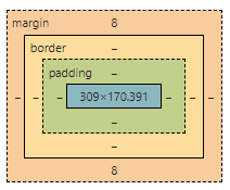
5. What is CSS Box Model?
CSS Box model defines the size, layout, alignment and design of the element. An element's layout is defined by following components:
- Content - actual element like images, text etc
- Padding - white space around the content
- Border - area around padding
- Margin - white space between different element

By default padding and border is not included in size of the element. To include these two properties to the total size of the element, you can use:
box-sizing: border-box;
6. What is RWD (Responsive Web Design)?
Responsive Web Design is way of designing websites so that it is displayed accurately for all devices. Responsive Web Design can be achieved using CSS media queries. Usually to design a website, mobile first design approach is recommended.
Mobile first design is an approach where website is designed for mobile in the first place. We can create layouts for specific screen sizes using following method:
/* Mobile - default */
.card {
    width: 100%;
}

/* Tablet */
@media and screen(min-width: 768px) {
    .card {
        width: 80%;
    }
}

/* Laptop */
@media and screen(min-width: 1024px) {
    .card {
        width: 70%;
    }
}
7. How do we add comments in CSS?
Comments are added as follows:
/* This is a comment */
.card {
    color: #000;
}
8. What is !important?
!important is rule in CSS which overrides the style of any specific element
.heading {
    color: red;
}

h1 {
    color: blue !important;
}

/* color will be set to blue because !important overrides the style */
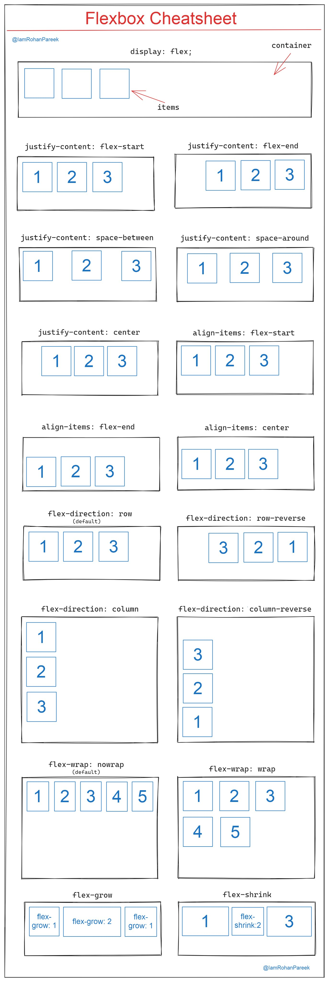
9. What is Flexbox?
Flexbox is a model using which you can make website layout design easy. In Flexbox, we first define a flex container and then proceed with aligning child elements.
To define a flex container, use following property:
.container {
    display: flex;
}
Using flexbox, you can easily align dom elements both vertically and horizontally.
Flexbox reference:

10. What is box-sizing?
Box Sizing defines how an element will take space. There are two properties used for box-sizing:
- content-box - border and padding is not included in total width
- border-box - border and padding is included in total width
11. Difference between visibility: hidden and display: none?
Both of the properties hides the element. The major difference is how it hides the element.
- visibility: hidden
- hides, but takes up space
- display: none
- hides, but doesn't take up space
12. What are CSS pseudo-classes?
Pseudo-classes are used to style a specific state of an element. It is defined as follows -
element:pseudo-class {
    /* styles */
}
Following are some of pseudo classes and it uses -
:hover - style when mouse hover over element
:focus - style when element is focused
:active - style when link is active
:first-child - styles the first child
:last-child - styles the last child
:nth-child(3) - styles the 3rd element
:invalid - styles any invalid input
:valid - styles any valid input
:checked - styles the checked state of input
:not(h1) - styles elements which are not 'h1' element
13. What is z-index?
Z-index is used to define how elements are stacked over each other. It can be written as follows -
selector {
    z-index: order; /* order is a number. More the order, higher the position on stack */
}
Example:
.lower {
    z-index: 100;
}
.upper {
    z-index: 200;
}
In the above example,
.upperdisplays on top of.lower
14. Name some of CSS frameworks/libraries
- tailwindcss
- styled-components
- bootstrap
- semantic ui
- material ui
- foundation
15. How to import CSS file in another CSS file?
You can import a CSS file using @import. Below is the example -
@import 'global.css'

/* other styles */
16. What are CSS Sprites?
CSS Sprites are a combination of multiple images condensed into one. It is used to improve efficiency and save and bandwidth.
Sprites Generators can be used to generate sprite images and then CSS background properties can be used to show specific images.
17. How to target and style multiple elements at once?
To style multiple elements at once, comma separated selectors can be used.
Below is the example -
input, select, textarea, button {
    width: 100%;
}
18. What is calc in CSS?
Calc is used to perform mathematical calculations for multiple CSS values.
Below is the example:
.container {
    width: calc(80% - 10px);
    height: calc(100px + 40px);
}
19. What are variables in CSS?
CSS variables are used to defines variable values that can be commonly used across different elements. It reduces code redundancy and can be useful in theming of websites.
It can be defined as follows -
:root {
    --theme: blue; /* theme variable will be available and can be used for all elements */
}
It can be used as follows -
.header {
    background: var(--theme);
}
20. What is CSS Specificity?
CSS Specificity tells which style will be applied for an element. Different type of selectors has different rank of selecting elements. Style will be applied to the selector with higher specificity.
Below is the order of ranking of specificity of different selectors -
- inline
- id
- class
- element
Below is the example where an element has different selectors -
#id {
    color: red;
}

.class {
    color: blue;
}

p {
    color: green;
}
*In the above example, text color will be red as #id selector takes precedence
What is CSS preprocessor?
CSS preprocessor is used to enhance normal CSS functionalities. CSS preprocessor have functionalities like mixins, variables, nested styling etc. The code from preprocessor gets compiled into CSS code.
Few of pre-processors are mentioned as follows-
- SASS
- LESS
- Stylus
- Stylable
What are CSS vendor prefixes?
CSS vendor prefixes, also known as browser prefixes, allow browsers to access new CSS features that are not yet stable.
Few of the vendor prefixes-
- -webkit-: Chrome, iOS and Safari
- -moz-: Firefox
- -o-: Opera
- -ms-: Edge, Internet Explorer